Well, I finally gave into the pressure of downloading Tik Tok and creating an account. I decided to log my journey and analyze the interface and user experience of the app as a first-time user for three months. During this time, there was a UI update, which we will be looking into that, as well. So, let’s get started!
Signing Up
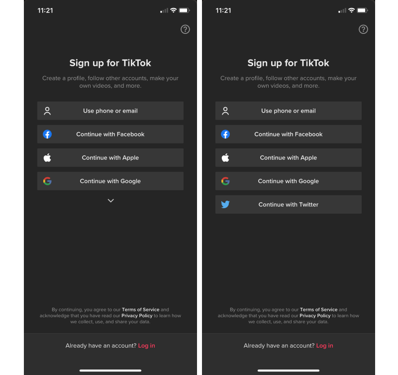
First, the app immediately asks the user to log in or sign up. I selected the signup option and saw that there are many ways to create an account on TikTok.
- Phone or email
- Apple
Twitter only appears when you tap the down arrow. I thought it was weird that there was a down arrow for only one other option, probably because TikTok might add options to sign up in the future.
I logged in with a username and password, and I had to input my date of birth. This is reassuring because, most likely, the app will restrict certain content and features for users under a certain age to keep them safe.
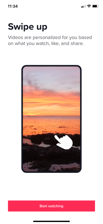
Then, I was met with a screen that tells how to view content on this app, by scrolling up and down as more videos show up continuously. Upon seeing this screen, my first thought was, “Well, isn’t that obvious?”, because most social media platforms, and digital platforms for that matter, display content through a vertical infinite scroll. I suppose that the purpose of this screen is to not have the assumption that everyone has experience with interaction of this nature.
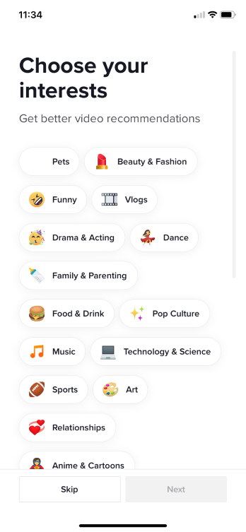
The app then prompts the user to select some starting content to fill their feed initially. There are many options for interests to choose from, but there are probably many more types of content available on the platform. The interests that I chose were Beauty and Fashion, Dance, Music, Food and Drink, and Anime and Cartoons.
I find it interesting that the method of input for this part of the sign up process is individual buttons, as opposed to other forms of input such as a drop-down menu or checkboxes. This method is much more straight-forward, quick, and easy for users to select their preferences because the buttons are large enough to select with the tap of the finger and it only takes one step to select (a single tap).
Tabs
After signing up, the app brings me to the home page, with five tabs on the navigation bar at the bottom of the screen. Tapping any of the buttons on the navigation bar will refresh the current tab's content.
Home

There’s a lot happening on the home page. The first thing I noticed was the “Following” and “For You” tabs at the very top center of the screen, which displays videos from accounts I follow and videos that TikTok recommends to me based on my viewing history. On the creator’s profile picture, there is a “plus” symbol that allows you to instantly follow them. I’m not sure how someone would want to start following a creator after watching only one video of theirs. There is also the username of the creator, the caption of the video, the "Like", "Comment" , and "Share' buttons.
The arrangement of the dashboard for the video shows a clear separation of information. Along the bottom of the video, is information about the video itself (the creator's username, caption, hashtags, the sound in the video). Along the right side of the screen are actions that you can take with the video (follow and view the creator, like, comment, and share).
There is an “Improving your feed” bar, which I imagine its purpose is to track the user’s initial browsing history. I found this interesting because, even when the bar is completely filled, the app will never cease to filter to your feed. One of the functions that social media apps thrive on is personalization. To keep a user’s attention, the app will continue to show them the kind of content that they want to see based on their viewing history.
In the top left-hand corner of the home page, there is a “Live” button that takes you to non-stop live videos of people whom I’m not following, which I don’t see the point of unless they are accounts that I’m following. There is already a Live section on the "Discover" tab (which we will look at in the next section), so I don't see the reason why it should be on the Home page.

The button that resembles a music record excited me because I am a fan of music and I love having background music. I always want to know the names of songs that I hear in the content that I watch. This feature that TikTok has allows users to do just that.

One significant characteristic that I noticed were that the videos take up nearly the entire screen, so it’s more in your face and makes it more difficult to ignore. The non-stop videos are based on the options I chose during the signup process. It’s very easy to get lost and spend more time on the app than originally intended due to how easy it is to swipe up to the next video. It’s convenient that the recommendations and following are separate sections, so there aren’t random recommendations for you in the middle of scrolling through your feed of the accounts you actually follow. There’s no disruption to your flow.
After using the app for three months:
There has been a UI update and the content is more personalized to my preferences.
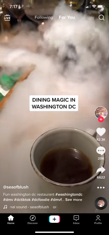
In the top right-hand corner, there is a search button which will lead you to the app’s main search feature. However, I don’t see the point in putting a search button on the home screen if there’s an entire tab dedicated to searching (the Discover tab).
When viewing a video, several elements and buttons that are initially visible are the creator’s name and profile picture, the description of the video, like, comment, share (to other apps, copying the link, sending it to a follower), and an ellipsis that expands to more options that you can choose to do with the video, such as reporting it and stitching it (which is TikTok's method of responding to a video with another video).
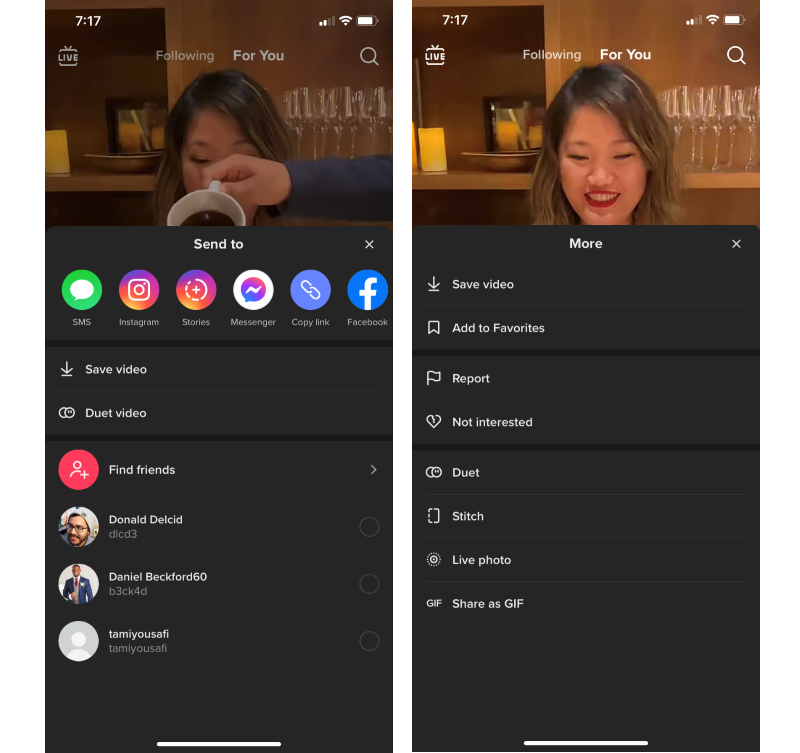
The More pop-up has three divisions of buttons.
- Saving the video two different ways.
- Actions that you can take if you see the video in a negative light.
- Adding onto or sharing the video in some way.
One element that confused me at first was the "Save video" and "Add to Favorites" options. The "Save video" buttons saves the video to the camera roll of your phone or device, whereas the "Add to Favorites" button saves the video to a section called "Favorites" on your profile on the TikTok app itself. The first time I encountered a video I wanted to save (on the app, not on my camera roll), I naturally hit the "Save video" button. I'm glad that both options are available, and it's very clear to me now which one's which.
Discover

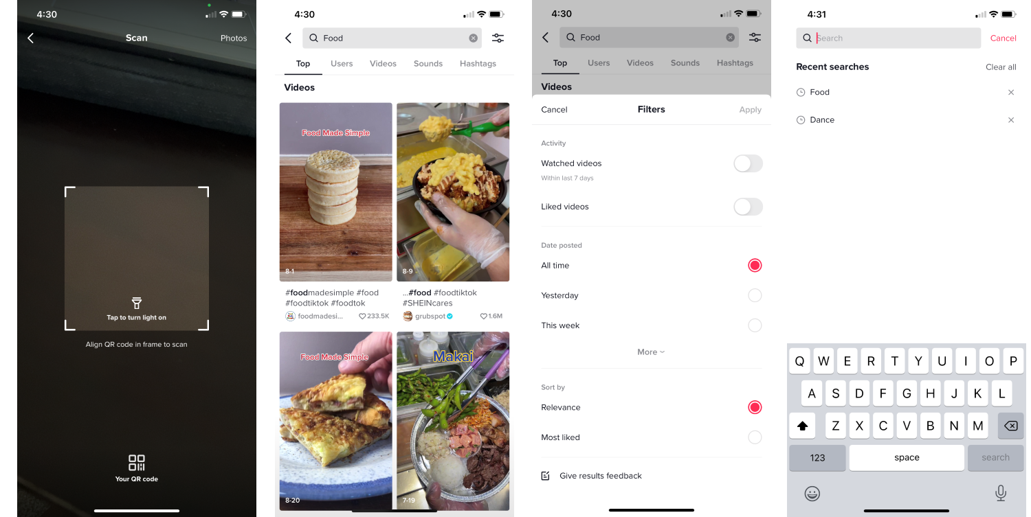
The “Discover” tab is fairly straight-forward with a search bar, ads for events on Tik Tok, popular hashtags, and sounds. It's not clear to me how TikTok decides what category of content (hashtags, sounds, etc.) appears on this page. It could be randomized or based on what's the most trending content regardless of the category.
The content on this page will most likely change the more I use the app to personalize to my taste and preferences. There is a QR code feature where users can find other people more easily, but this only works out when you are physically in the same proximity as another person. I like the filter options as it helps narrow down your search, as well as the ability to give feedback, which demonstrates that TikTok is always looking to improve. There are helpful search features such as seeing your search history, being able to delete individual searches or all of them.
There is a common question regarding deleting items in a list format such as the search history seen below. Some mobile applications requires users to swipe on an item to view actions to take with it. For example, on many emailing apps, users can archive, delete, flag, or pin an email, and they can swipe left on it to see those options. In this case with the TikTok search history, the only action is to delete, so the "X" is already visible and selectable for the user, which is a good choice.
After using the app for three months:
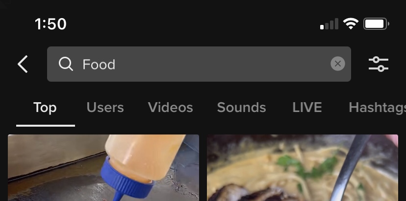
One change to the UI is that when you search for something, there are more categories for when you are looking for a specific type of content, including users, videos, sounds, live videos, and hashtags.
Inbox
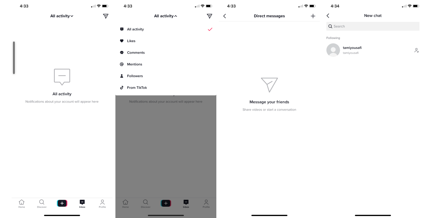
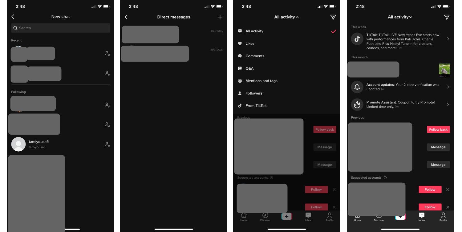
The “Inbox” tab is where you see all your follower requests, DMs, likes, comments, announcements from TikTok, and changes to your profile or settings. Of course, it asks if you wanna turn on notifications. It’s convenient that all of my account’s activity is all in one place, and the filtering options makes it SO much easier!
After using the app for three months:
I have actual activity on my Inbox tab, such as Likes, people who followed me, follower suggestions, follower requests, TikTok promotions, and DM's from friends. There are also more filters to choose from.
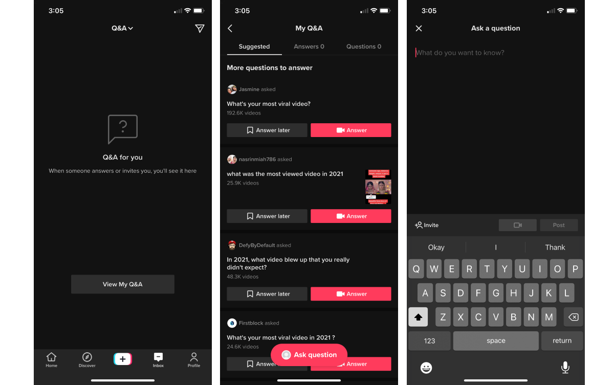
The Q&A feature is something that I have never seen on a social media app before. You can post questions and get answers from your followers, as well as take part in and answer other people's questions. This is a method of interaction resembles Quora or Answers.com. I think it's interesting and, given that there are many users on TikTok, you will be able to get many answers for your questions.
Profile
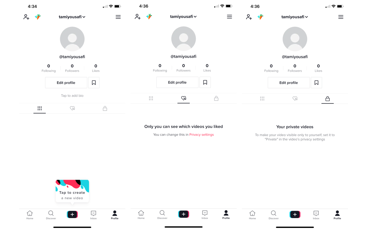
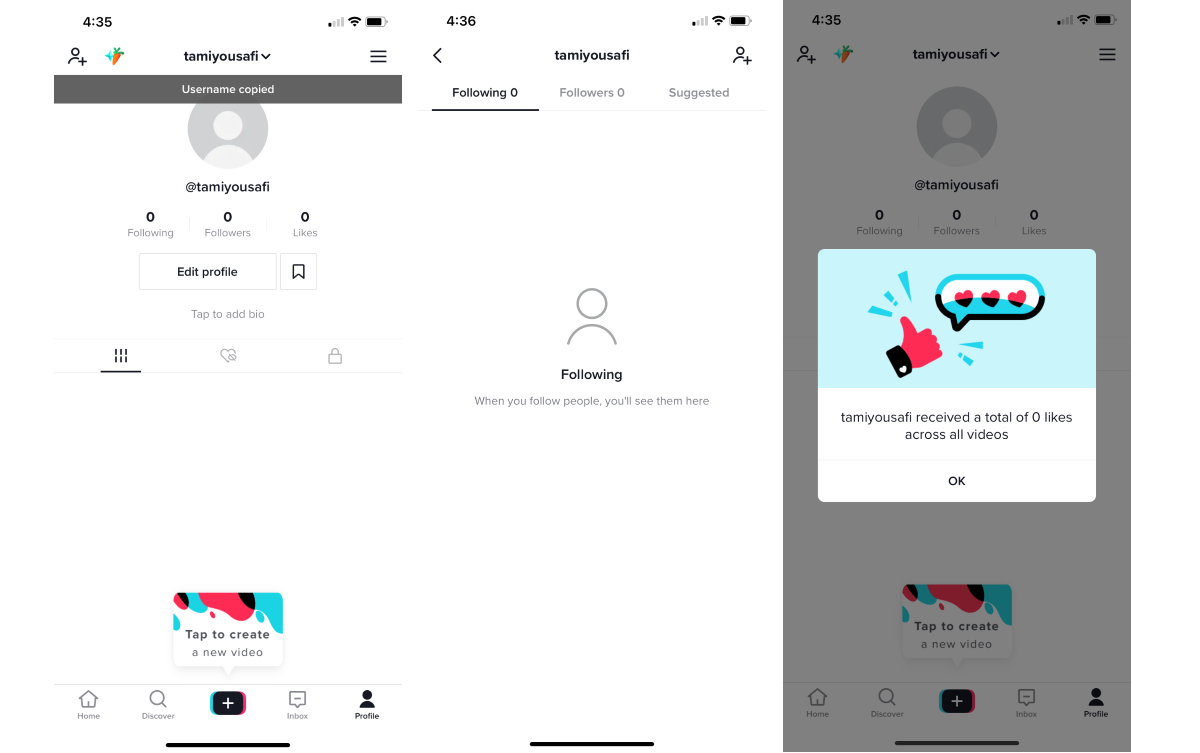
The Profile tab is where the user keeps track of their own content and information. You can keep track of videos that you have liked and make individual videos private.
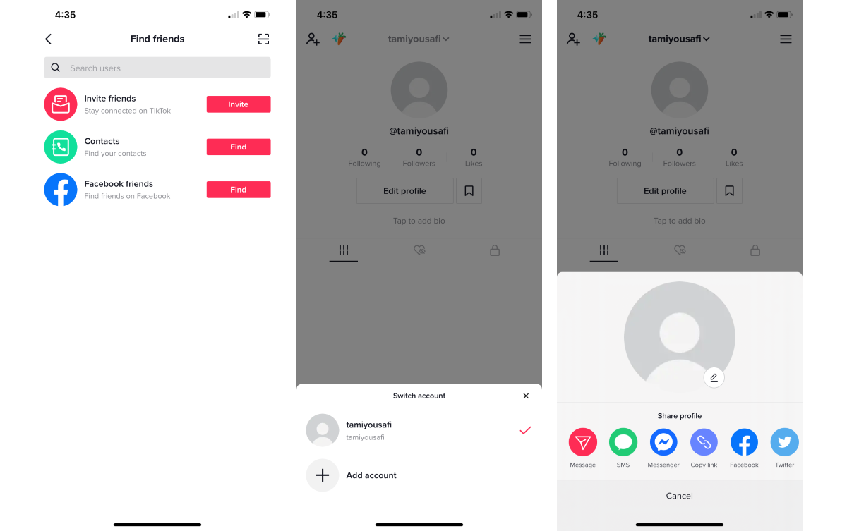
There are many components that make up your profile:
- Finding friends through other sources such as your contacts and Facebook
- Sharing your profile through different routes
- Switching accounts, which makes it easier to keep track of all your profiles without having to log out and log in every single time
- Copying your username by tapping it
- Viewing your followers and who you are following, as well as suggested accounts to follow
- Viewing the number of total Likes of all of your videos
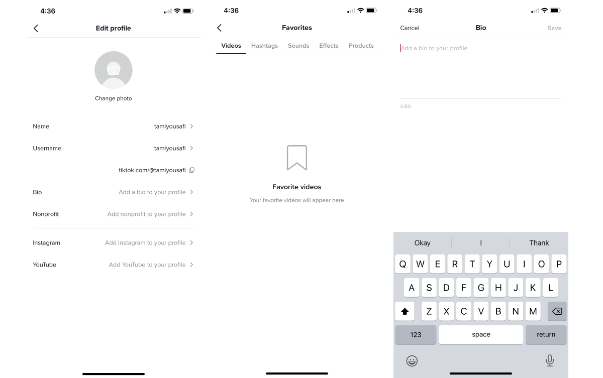
- Editing your profile
- Viewing the content you saved to your Favorites, divided into categories for easy viewing
- Editing your bio
Displaying the total number of likes that a user gets on all of their videos adds a new metric to a user’s credibility, similar to the number of followers they have.
After using the app for three months:
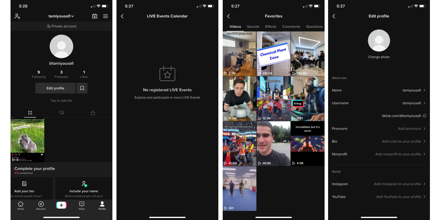
I have several followers, liked videos, and favorites. I'm also following several accounts. There is now a Live Events Calendar, which most likely posts scheduled live videos. The "Favorites" section now has more categories: comments and questions. It is a good idea to make sure that the user can save whatever piece of content that the app offers. There is also a new piece of information that the user can add to their profile information: pronouns. I like this addition because it will help people identify the user in the way that they want to be identified.
Settings
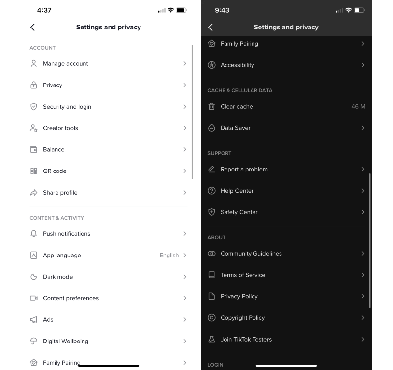
You can reach the Settings section by tapping the hamburger button in the top-right corner of the Profile tab. When looking through all of the different settings, there are several features that caught my eye. The user has the option to make a Business account, which probably offers services to promote their business, such as advertising, reviews, and ratings. There are also Creator Tools which include analytics, promotions, and resources to teach creators how to use TikTok to their advantage. The TikTok Creator Fund surprised me because this is the first time I've seen a social media platform directly tell the user how they can make money through their content.

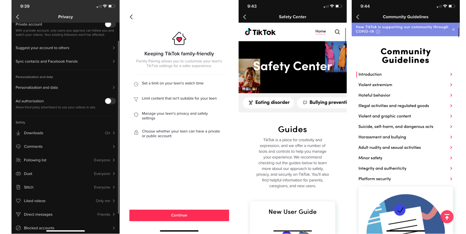
It calms my heart seeing the many privacy options available, family-friendly details, and a Safety Center. There is also a section that lists Community Guidelines that clearly communicate behaviors and activity that TikTok does not condone.
I'm curious about the kind of action that TikTok would take should there be inappropriate behavior or content on the app. Is it solely through reports that users file? Is there a filtering or approval system that all content must go through to be present on the app?
I also wonder how content is categorized as family-friendly or age-appropriate for kids and teens. There are many kids and teens who use TikTok as young as elementary school. Are there algorithms that look at the dialogue or images in the content? How do parents and guardians of young children ensure that they don't watch anything that is outside of their maturity level?
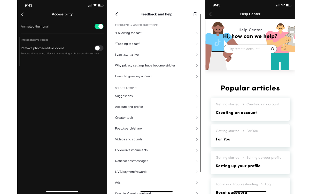
A setting that every app should have is Accessibility and a Help feature which users can go to when they are having trouble or need assistance in using the app. This gives users even just the opportunity to access the features that the app provides and be able to use it to its fullest potential. Feedback must also be a required feature for every app so that it has the chance to improve and become even more usable.
After using the app for three months:
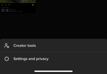
As you could probably see, I switched to dark mode because it saves energy and, in my opinion, looks awesome! When you tap the hamburger button, a pop-up appears which gives you the option to navigate to either the Creator tools or Settings and Privacy. The reason for this separation is likely to make the Creator tools more easily accessible to the user so that they can enhance their profiles and accounts.
Creation Time!
Going to where the magic happens, I tap the "plus" button in the middle of the bottom navigation bar to see the creation section.
Photo Mode
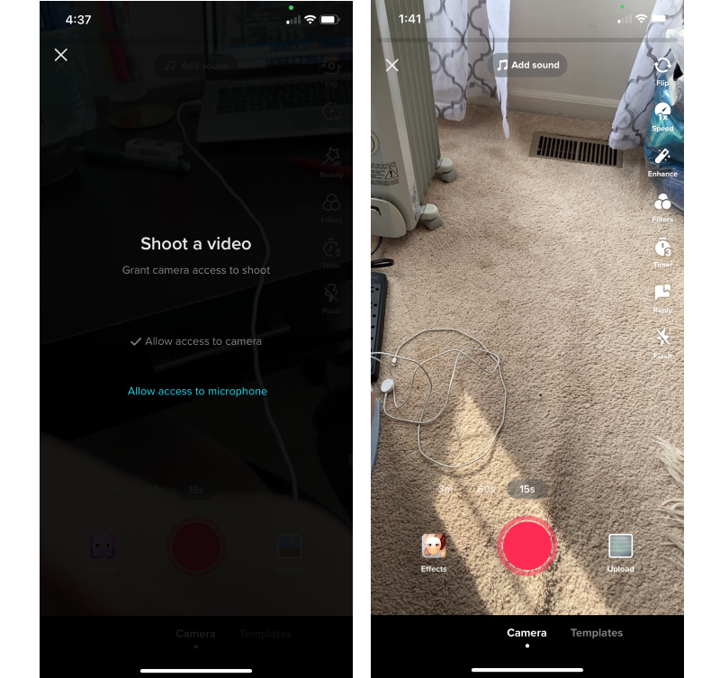
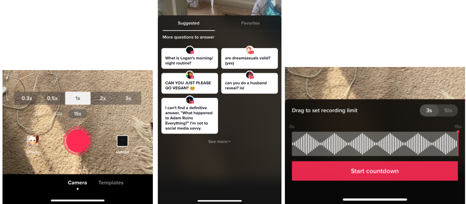
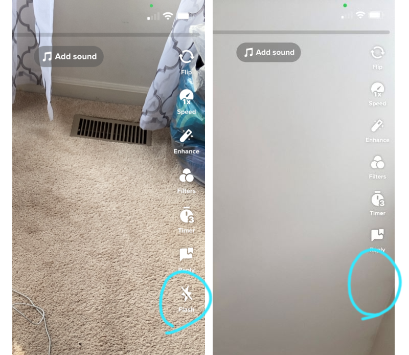
First, the app prompts the user to allow access to the camera and microphone, as these two elements are vital for this section. The dashboard of the camera mode is organized with the right hand side aligned with the ability to flip the camera, speed, enhancements, filters, a timer, the option to reply to a question, and a flash. These are common camera utilities that the user can get creative with.
The "Enhance" button does a simple effect of clearing imperfections on your skin (also called "Beauty Mode"). This could be an effect, but TikTok probably separated it from the effects because it's more simple and more commonly-used.
The "Flash" button disappears when the user flips the camera to selfie mode which is good UX because it implies that there is no flash on the front camera of a smartphone so there's no reason to have the flash option on the screen. An alternative to this would be to keep the flash option on the screen but have it disabled so the user won't be able to select it, but that could cause confusion.
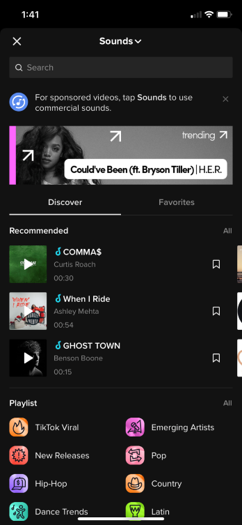
At the top of the screen, is a bar to keep track of the length of the video and an "Add sound" button where users can insert music or sound effects to any part of the video. At first, I was confused as to why the "Add sound" button was at the top separated from everything else. The reason that I can observe is that the sound is the only element that you can add to a specific snippet of the video.
At the bottom of the screen, users can take photos and videos, choose videos and photos from their camera roll on their device, as well as choose effects and templates. I was initially confused about the difference between effects, templates, and filters.
- Effects are much more animated than filters, they can include graphical images and text
- Templates are videos formats
- Filters refer to the color and mood of the entire photo, similar to the common filters in photography
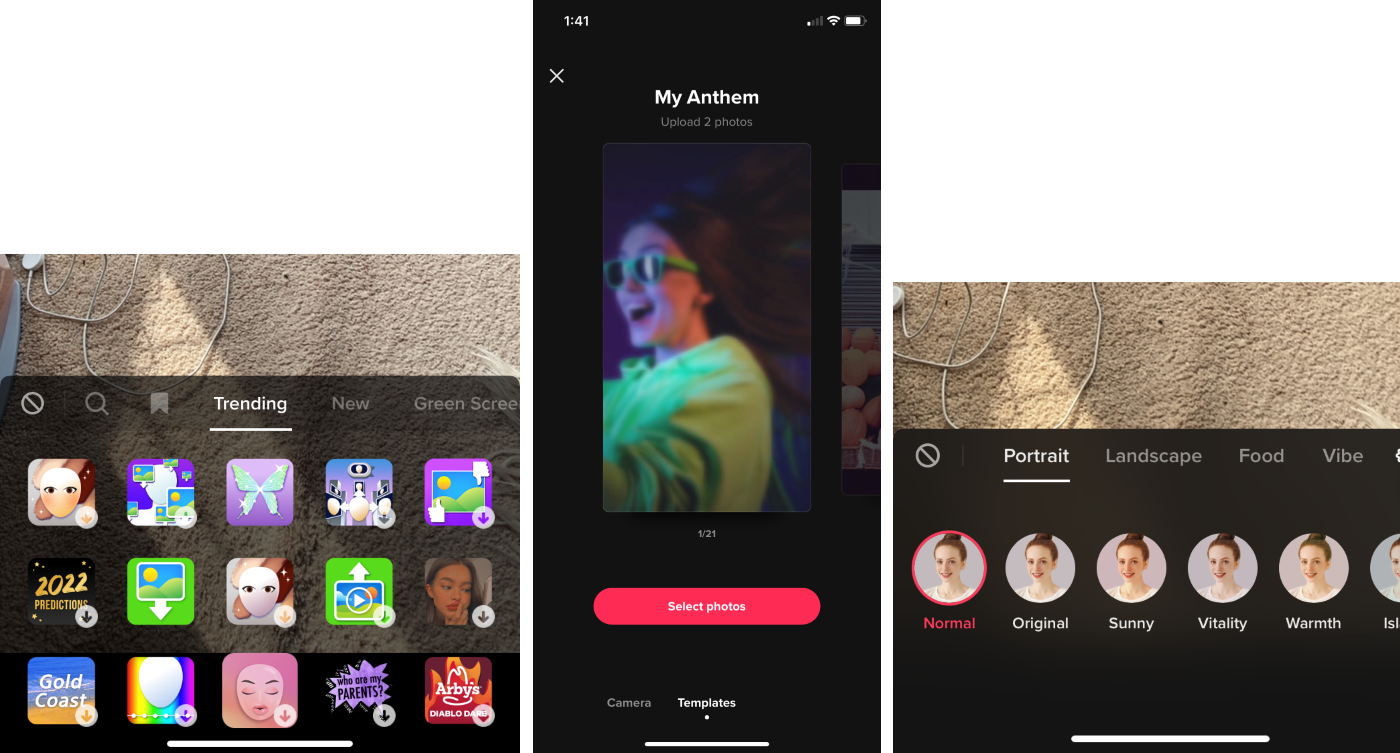
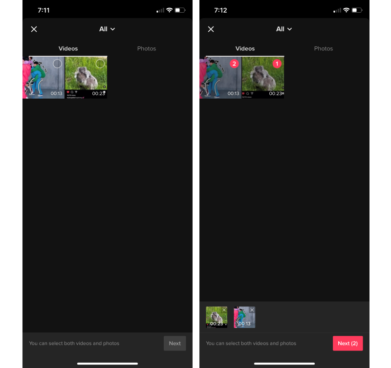
After finally coming up with an idea for a my first video, I start creating it. You can choose as many videos or photos as you want.
Sound Section

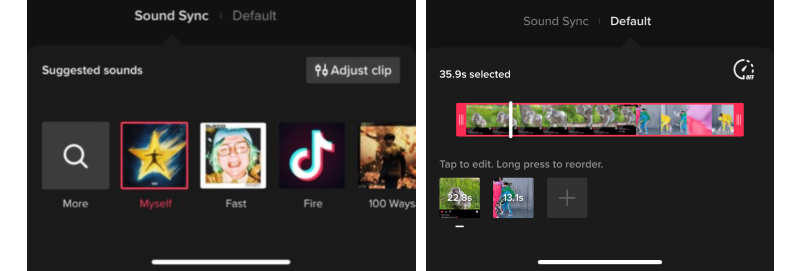
If your selection includes only photos, then the app skips this part. However, I chose two videos from my camera roll, so I must go through a section where you can edit the audio of the videos. Here, you can input sounds or music to parts of the video, arrange the order of the videos, add more videos/photos after already selecting some, and record your own sounds.
One of the first details that I noticed and that confused me was that the page opens with the “Sound Sync” tab open by default, instead of the “Default” tab. I'm ensure why the tab named "Default" is not initially appearing when the user reaches this section.
Video Section
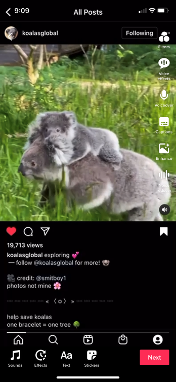
Moving onto the fruit of the creation area where there is a dashboard of different tools to edit the video. On the right side of the screen there are six buttons:
- Filters - the same effect from the photo mode
- Voice effects - change the sound of the audio
- Voiceover - record your own audio to add to the video
- Captions - add captions to the video. If the app cannot detect any dialogue from the audio of the video, then a message appears letting you know you cannot add captions
- Enhance - the same effect from the photo mode
- Noise reducer - clean up the audio of the video

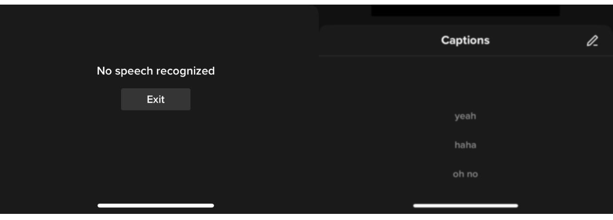
The enhance and noise reducer settings are like toggle buttons because the only options for those are off or on. A message shows up at the top of the screen when they get turned on and a red check mark appears on the button icons. I think this is a very straightforward way to communicate that these tools have been activated.

In the video that I'm trying to make, I'm using two videos, but the buttons on the right side of the screen change depending on if you are editing a video or photo and if you add a sound. If you are working with just one photo, the "Noise reducer" button does not appear and the "Voice effects" and "Captions" buttons are greyed out because a photo does not have audio. If you add a voiceover, then the greyed out buttons become selectable. When you tap on the greyed out buttons, an alert pops up at the top of the screen letting you know you cannot select those options.
If you are working with a photo and a video, then the "Voice effects" buttons does not appear. If you are working with multiple photos, then the "Voice effects" and "Noise reducer" buttons do not appear.

When I first noticed this, I legitimately got a headache. The only buttons that are not consistent are "Voice effects", "Captions", and "Noise reducer", which makes sense considering your creation needs audio for these elements to come into play.
At the bottom of the dashboard, you can add sounds, effects, text, and stickers.
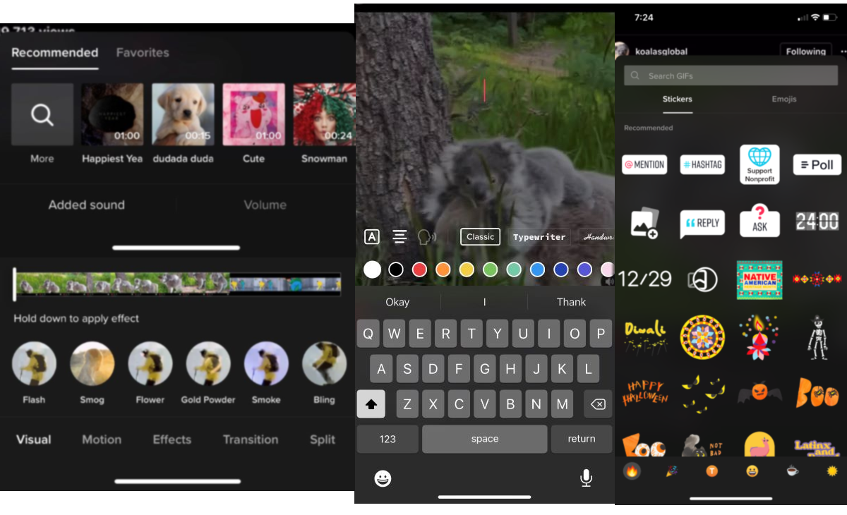
Uploading and Aftermath
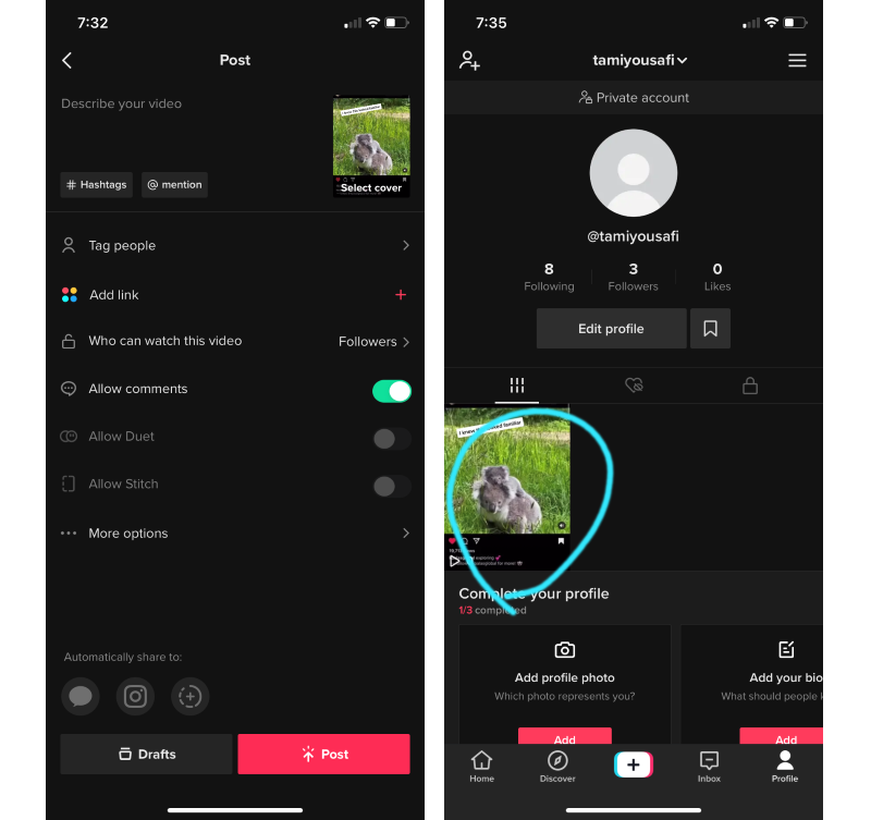
When you finish creating your video to your liking, you then move onto the upload section where you can add a caption, tag people, choose privacy details, and share it to other platforms. When you upload it, it gives you a percentage and the circle to indicate it's progress. Once uploaded, it gives you links to share the video elsewhere, such as other social media, messaging it to someone through the app, or copying a link to the video. You can then see your video in your profile.
Conclusion
After investigating for myself what the hype surrounding the next big social media platform, I realize why so many people of all ages are hooked on this app.
Some of my favorite things about this app is that there are resources for creators to best use the app for their businesses and brands and there is more direct communication regarding how to use the app and guidelines for usage. I also love the consistent categorization of the content, which makes it very organized.
The biggest detail about this platform that takes the cake for me is that TikTok provides a very straightforward way of creating videos and publishing them. Users can edit videos directly on the platform, rather than editing on another app before posting it to TikTok.
Some things I would like to see in the future include accommodation for horizontal videos, more security and safety features involving spam messages and accounts, and the ability to make albums of your saved content.
TikTok has gained momentum in the recent years, and I predict that it won't slow down anytime soon.

